
Importance of Color in Visualization
Introduction
Color is an extremely powerful channel, and it is ubiquitous in visualization.
We will focus on three main purposes of color.
- Pattern detection in the data.
- Labeling data to distinguish between different categories
- Highlighting specific objects or instances to drive attention to some specific regions or objects.
We will be covering three main aspects:
- Color perception
- To understand how humans perceive color, how color perception works because this knowledge in turn is going to give us knowledge on how to use color effectively.
- Color specification
- To understand how to specify colors in a way that is useful to visualization design, and not only useful but also natural and certain ways of specifying colors which is better than others.
- Color use
- we need to use color in visualization design after discussing perception and specification.
Color Perception
We have already got the idea of the human visual and cognition system and how it perceives a visualization. Now, let's understand a bit more about the perception of color by eye.
We have two types of sensors in retinas:
-
Rods
- Sensitive in low light conditions
- Used very rarely
-
Cones
- Always sensitive except when there is no light
- There are three types of cones sensitive to different wavelengths
Three Chroma C theory
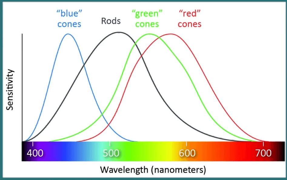
- The 3 types of cones are respectively sensitive to short, medium & long wavelength
- We perceive color as a three-channel system
- Short-wavelength - blue cones
- Medium wavelength - Green cones
- Long-wavelength - Red cones
- We don't describe color naturally as the combination of red, blue, and green.
- It's very hard for us to think about color as a combination of these three values or the intensity of these three colors.
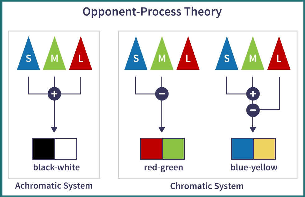
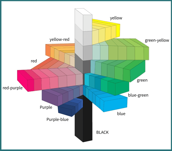
Color opponent process theory
-
Human brain process signal received from the above sensors with the help of the visual cortex by creating three different channels.
- Red-Green Channel
- Blue-Yellow Channel
- Black-White Channel
-
The theory says that the three different sensors, the blue, the green and red, the short wave, mediumwave, and longwave are combined in the visual cortex.
-
Finally, these three sensors are combined by our visual cortex to create three main axes that are the three axes described by the opponent-process theory and these three axes are black and white, which give the amount of light, luminance, that is created by color, displayed by color, and then we have what is called the two chromatic axes that are the red and green axis and the blue and yellow axis.
-
Color blindness people are not able to distinguish red from green or, more rarely, blue from yellow, which again is another important fact.
Now, we are familiar with color perception by human vision.
Color Specification
We need color specification systems to specify colors in a way that is helpful for visual representation that is reliable and uniform across different devices.
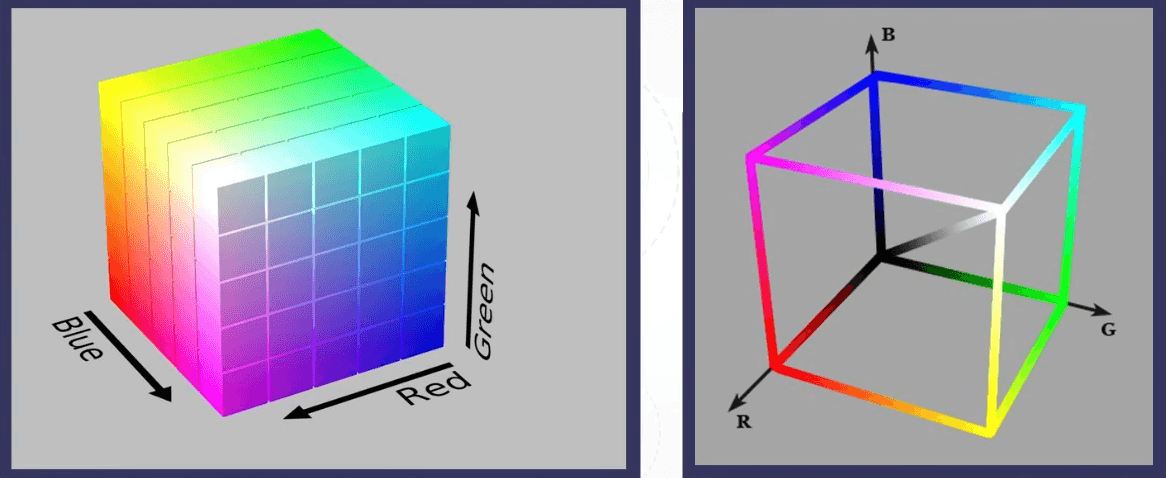
Every color can be expressed as the sum of three colors, or in general, every color can be expressed in a three-dimensional space. To generate a given we ned number or the value of these three intensities, the intensity of blue, the uncertain intensity of green, and the intensity of red. This is a part of a large color space.
Color Space
-
A color space is a system typically of three variables, in a three-dimensional space, that describes uniquely a color.
-
Gamut - The three primary axis of each color space.
-
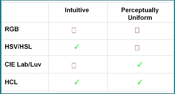
RGB Color space
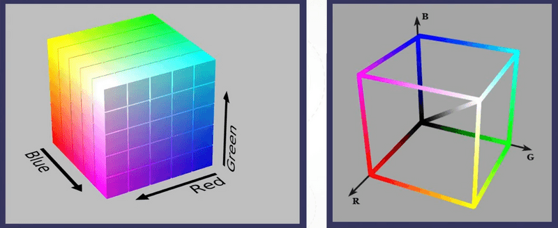
- RGB stands for red, green, and blue.
- These three primary colors are used as the basis physically to represent colors.
- It is not useful as a color space to use in visualization design because the changing of intensity is not natural and this is not the way we perceive color.
- We have to use a color specification system that is more natural.
-
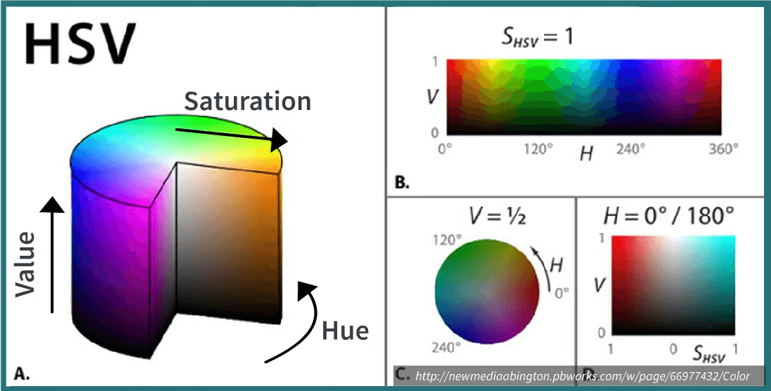
HSV/HSL Color space

- HSV stands hue, saturation, and value, or HSL stands for hue, saturation, and lightness.
- They use channels or axes that are closer to the way we want to specify colors.
- Hue is the name of the color. Green, red, blue, yellow, and so on.
- Saturation is how vivid the color is, the colorfulness of the color.
- Lightness is the amount of light, the brightness of the color.
- It is not perceptually uniform which is a problem with this space.
- It means that distances that are calculated in the color space mathematically do not correspond to perceptual distances. So the difference between colors that we perceive with our eyes.
-
CIE Lab/ CIE Luv Color space
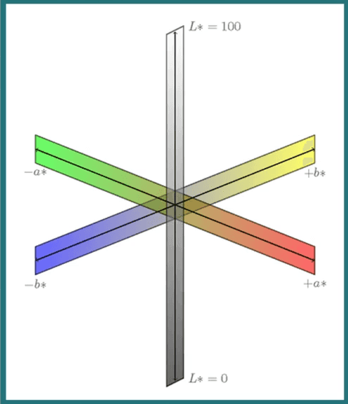
- These are perceptually uniform colors spaces.
- L channel -> lightness
- a* channel goes from one chromatic axis that goes from green to red.
- b* channel goes from one chromatic axis that goes from yellow to blue.
- It is a nonlinear transformation of the physical measure of the color.
- Usable -> HSV > CIE lab
-
CIE LCH(HCL) Color space

- It is the space which is both usable and perceptually uniform.
- a*, b* -> C*(Chroma, relative saturation), h°(hue, angle of hue), L (lightness, Luminance)
-
Comaprison
Color Use
We can now use color in visualization design after reading about color specification and perception.
There are two main purposes of color
- Map quantities to color
- Labeling
Quantitative Color Scale
-
Color scales are designed to represent quantitative information.
-
These properties should be fulfilled:
- Uniformity - A difference in the value needs to be proportional to the difference that is perceived
- Discriminability - If we have more colors, the higher the number of different colors that we can extract visually from the visualization.
-
Creation of Quantitative Color Scale
-
Single Hue Sequential Scale
- The idea is to have a perceptual sequence of values that changes according to lightness or luminance.
- Choose one value
- Map value to luminance
-
Multi Hue Sequential Scale
- The idea is to still have a perceptual sequence of values that changes according to lightness or luminance but go through multiple hues.
- Perceptual Sequence preserved.
- Multiple hues used.
-
Why use a multi-hue sequential over single hue sequential?
- It is more aesthetically pleasing.
- High discriminability
- Easy segmentation and labeling
-
Categorical Color Scale
-
Color scales are designed to represent categorical information.
-
These properties should be fulfilled:
- Uniformity - The main idea is that if some colors are lighter/brighter/more saturated than others, they attract attention more than the others.
- Discriminability - We want to have as many colors as possible that can be distinguished perceptually.
-
Creation of Categorical Color Scale
- HCL Space
- Choose constant chroma and luminance
- Sample uniformly a cross hue value
- We can perceive 5-10 distinct codes.
- HCL Space
-
Color conventions and Semantics
- While designing visualizations that rest upon some semantic associations, we always have to be careful and think about whom the readers are going to be, whether this can be confused or not.
- Red => Danger/Blood
- Green => Ok/Good
- Pro: Intuitive when used appropriately
- Con: May not apply to some cultures
Diverging Color Scale
-
Color scales that are designed to represent diverging information.
-
It is useful or necessary to distinguish values above and below a threshold.
-
It encodes two properties at the same time
- Above/Below threshold
- Magnitude
-
These properties should be fulfilled:
- Quantitative and Categorical properties should be fulfilled.
- Same luminance "ramp" on both sides
-
Creation of Diverging Color Scale
- Join two separate color maps with a different hue and same luminance gradient/steps
We covered so far are using color to encode information about quantity, for magnitude representation and sequence. The idea of using color as a way to categorize or label data according to several categories. We also saw that there are several methods to create effective color maps or color scales to represent color for these purposes.
Using Color to highlight/emphasize
Use different shades of grey for what is not the main piece of information that you want to communicate and use something that is colored so that it stands out compared to the rest.
Perceptual issues with Color
Color Blindness
-
All types of color blindness mostly depend on problems with the photoreceptors that are in the eye.
-
Short Wavelength receptors absent -> Tritanopia
-
Medium Wavelength receptors absent -> Deuteranopia
-
Long Wavelength receptors absent -> Protanopia
-
How to design visualization
- If the difference between the colors is due to the difference between blue and red shades, in most cases, these can be distinguished.
- Play with color intensity but it is a tradeoff b/w categorical scales discriminability.
- Use Colorblind safe pallets
- Blue/Orange and Blue/Red are normally safe.
- Test design with color blindness simulators.
Effects of Size
- The size of an object on the screen affects the way the color is perceived.
- Small area -> High Saturation
- Large area -> Low Saturation
Effects of Contrast
- It is the difference in colors, that make objects distinguishable.
- It is important because visualization is often organized in layers and we find good relationships within these layers with help of contrast.
- It is necessary for separation.
- Luminance helps to create contrast between objects.
Effects of Background
- Color that that is used for the background, affects the colors that can perceive in the foreground.
- It affects the perception of symbols that use luminance based color ramps.
- Color constancy - It means that the same patches of color they are perceived as different if the background is different.
We discussed the main purposes of color and covered its main aspects. This concludes this article.
Did you find this post useful?
I would be really grateful if you let me know by commenting below. Means a lot to me!
Sign up to get updates when I write something new. No spam ever.
Comments