
Visualizing Geographical Data
Introduction
The first thing that we need to define when we talk about geographic visualization or visualization of geographical data, is to define what geographical data is. So, broadly speaking, I would define geographical data, any dataset that contains some geographical information. So, let's try to define a little bit more precisely what this type of information can be.
There are two broad classes of geographic information.
Spatial objects
-
Objects that have a geographical shape and some spatial extent
-
A map is the main object of interest
-
counties, regions, buildings, or lakes
-
Types of Spatial objects
- Regions - Country borders
- Location - Latitude and Longitude
- Identifiers - Zip code, Street name
-
Geocoding: Process of translating an identifier into a specific location
-
Reverse Geocoding - Process of translating a location into a specific identifier
Non-Spatial objects
- Objects that can be geographically located
- Shape and spatial extent don't matters.
- Role of the map is to only be a reference to see where these objects are located
When and Why use a map?
The most important question you have to ask yourself when you are dealing with data that contains geographical information is whether you're going to need a map or not? People tend to think that every time there is geographical information containing the data, then you necessarily have to use a map. That's not the case. Let's understand when is it desirable to use a map.
- When one is trying to understand or communicate the spatial location or spatial extent of the data.
- When we want the audience to be able to point to a specific region or find a specific region because they are familiar with the map.
- The goal is to correlate a phenomenon to spatial location/object.
- Goal pertaining phenomena for which spatial proximity or event is important.
Visualization Techniques
Dot maps
-
A single dot represents an object that is geographically located.
-
There is a substrate that is the map behind the dots and the dots represent specific kinds of events or objects. These objects or events are geographically located and they are positioned in their geographical position.
-
Advantages:
- The information that you can extract out of them is density and distribution and they are useful in depicting density & distribution of geolocated objects.
- They can also encode categorical values with color.
Heat Maps
-
A map that tries to visualize or represent the continuous spatial distribution of some quantity.
-
They are obtained using a density estimation method which estimates a continuous density model from discrete data.
-
Relies heavily on color so it's crucial to use color effectively.
-
Rainbow color maps
- It tries to represent quantity, a continuous value through different hues. Going through different frequencies of the spectrum.
- The intuition here is that just by going through all the frequencies, then we have a natural representation of light.
- The problem is that the human eyes interpret quantity by using only what is called the intensity or luminance channel of the color and the rainbow color map goes through several different color intensities when you start from the bottom of the color map to the top of the color map.
- It's very hard to convey quantities with the rainbow color map and using perceptually uniform color scales is the best way to overcome this.
Hexbin Maps(Binned Maps)
- A map where we look at the geography and split the area or organize the areas around some specific geometries. Hexbin maps use hexagon geometry.
- Hexagons are is used because it's a shape that permits to more easily create contiguous areas while dividing the whole space into discrete units.
- The idea is to visualize density or sometimes other values as color intensity within each of these bins.
- We can visualize categorical information rather than quantitative information.
Choropleth Maps
-
A map where we want to visualize some values associated with some regions.
-
Borders are drawn so we can identify for any places.
-
The shape of specific regions is used in a choropleth map to identify these regions.
-
It's colored with the color that is proportional to a value of interest.
-
Issues with choropleth maps
- Have to decide the level of detail, what to show on the map.
- Have to be careful with the color mapping step.
- When using color, one problem that arises is that distribution of the values may be skewed. This can be solved by using non-linear mapping.
- The issue with showing the color of categorical values.
Graduated Symbol Maps
- It uses the size of symbols to represent quantity.
- The perception of the size of the symbol is not affected by the size of the regions.
- It's possible to map more than one value/attributes.
- Dot Maps -> Objects
- Heat Maps and Binned Maps -> Density
- Choropleth Maps and Symbol Maps -> Values
Common Issues with Maps
Base rate bias
- The problem is that human-related events are very often correlated with population density, and these often come up when visualizing data on a map.
- The only way to prevent that is to normalize data according to population.
Insenstivity to sample size
- The problem is that when there are large sample sizes, values tend to converge and tend to be stable around a given mean, but when sample sizes are small they tend to very easily oscillate and be either very high or very, very low.
- Stability: Large Sample Size > Small Sample Size
Skewed spatial distributions
- The problem is that geographical regions may be distributed in a non-uniform way. Eg: World Map
- Color perception is affected by size.
- The one way to solve this is using a cartogram which is a geographical map where the objects used to represent the regions are no longer represented by the actual borders of these regions, but they're represented by some other symbols. Here we will use Dorling Cartogram in which these symbols are bubbles.
- Topological relationship: If we take any two areas and we have one area that is on the top right to the other ones, it's always on the top right and so on, and that's true for every pair of areas.
- Bubbles are positioned using an algorithm that keeps intact the topological relationships between the areas, but at the same time uses symbols of the same size or different sizes that are not proportional to the actual area of the region, state, country, and so on.
- We can use color and size to represent other pieces of information assuming the topological relationships of these objects, and the regions are preserved.
- The downside of this is that we have to abstract away from the actual shape of area or regions and it's going to be harder to recognize them.
Perceptional issues
- It is hard to estimate and compare values with color intensity and color perception affected by area size because context affects perception.
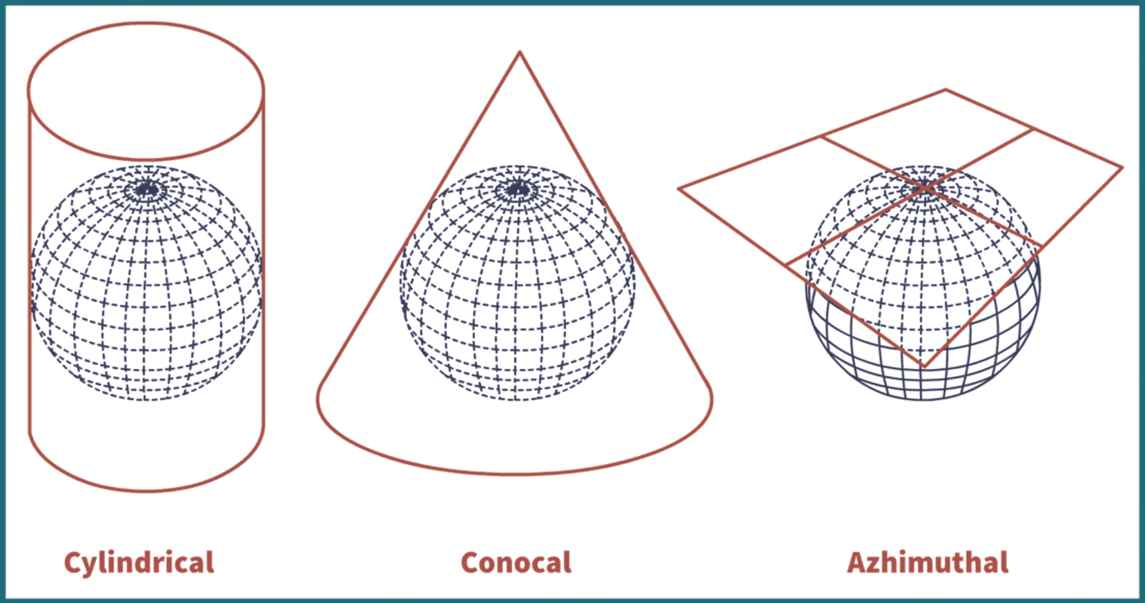
Map projection
-
The problem is that every single map is a 2D projection on a surface of a natural surface on the earth, on the globe. So we are transforming or projecting data points that live on the surface of a sphere into a location on a plane.
-
We have three types of projections:
-
All projections involve distortion of one or more of the following:
- Angles
- Area
- Shapes
- Distances
- Directions
-
Distortion increases from point of contact.
-
Larger areas are more prone to distortion.
-
Guidelines
- Cylindrical around the equator
- Conic for middle latitude
- Azimuthal for polar regions
-
Representation of distortion - Tissot's Indicatrix
- The idea is to have a circle in the original surface and see how they are distorted once they are mapped on the plane.
- Mercator - No angular distortion
- Gall peters - Area preserved and Shape distortion
- Robinson - Compromised
-
Projections
- Equivalent: Preserve equivalent area useful for world maps and small scale
- Conformal: Preserve angular relationships useful for large scale maps.
Interferance from Map features
- The focus in visualization is on the spatial distribution of values contained in data.
- It's a tradeoff
- Too many details - map interferes with data
- Too few details - context is lost
- It also depends on the goal/task.
- The information displayed in the map should never interfere with the representation of data.
- Guidelines:
- Few colors/Low saturation (greys are great)
- No strong line/borders
- Include only necessary spatial features.
Geo-visualization with time
- It's a very interesting problem because we want to map data on geographical representation, but this data, at the same time, changes over time, and we want to have a visual representation that depicts spatial distributions or spatial configurations. But at the same time, how the spatial configurations change over time.
Geo-data + Time Visualization Techniques
Animation
- The basic idea is that we are mapping the original variable of time into actual times because we're animating the change over time through animation.
- It is often catchy, pleasing, and has good aesthetics but it's not that effective because everything is changing, and it's changing typically very fast, so it's very hard to follow what is going on.
- Works well when trends are easy to follow(coherent trends)
- Usability
- Make it user-controlled
- Pairing it up with a timeline
- Coloring time (if appropriate)
- Use traces
Faceting
- The idea here is to, instead of using animation to repeat multiple versions of the same map where each version represents one point in time.
- The animation is harder to follow but of higher resolution. Faceting is less familiar but less confusing.
Getting rid of Map metaphor!
- Whenever you find yourself facing the problem of having to show spatial-temporal data, so you have both geographical information, spatial information, and temporal information, you may want to ask yourself or you may want to consider the option that by getting rid of the map metaphor, you may gain by showing more information with the existing visualization methods that allow you to visualize data over time without maps.
Did you find this post useful?
I would be grateful if you let me know by commenting below. Means a lot to me!
Sign up to get updates when I write something new. No spam ever.
Comments